Nuclear Verdicts Defense Institute

Crafting a cutting-edge platform
for Legal Education

View Site
Web Design
Branding
Visual Design
WordPress
I was deeply involved in designing the brand identity and extending its visual personality to the site. My contributions spanned logo design, branding, web design and prototyping, site maintenance, social media, and marketing. This project was an exciting opportunity to apply modern design principles and create a seamless, cohesive brand experience from the ground up.

The Challenge

Evolving Towards High Fidelity

Building on insights of the competitive analysis, Ripemetrics’ new identity began to take shape. The brand's palette was applied more dynamically, and the use of authentic imagery brought us closer to our intended audience. Emphasizing approachable visuals while maintaining expertise credibility.

The Opportunity

We approached this project with a unique design challenge. creating a brand identity that stood independently from the main company hosting the event while embodying the energy, optimism, and self-actualization central to an educational program.
  • Logo Design - The logo needed to balance the strength and reliability of a legal entity with the vibrancy and growth potential of an educational institute.
  • Brand Palette - Purple was chosen as primary brand color to evoke prestige, wisdom, and creativity.
  • Visual Inspiration - The composition and layout drew influence from tech websites; emphasizing innovation and forward-thinking. Supporting the groundbreaking nature of the event as the first of its kind in the industry.
The CompetitionWe analyzed several educational and industry websites to identify design trends that combined modern aesthetics with user trust and engagement.

Harness Projects

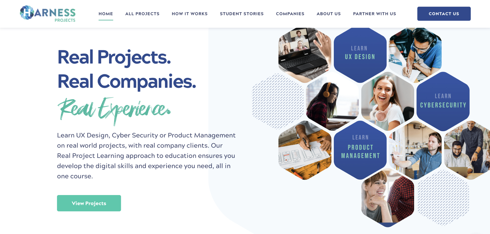
This site showcased a seamless blend of humanistic design with tech-inspired SaaS sensibilities. Its pattern motifs and focused layouts provided early inspiration.

Big Education Conversation

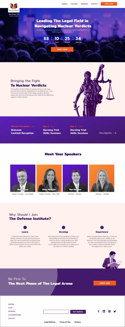
A standout example of bold, contemporary branding that harmonized with clear and impactful messaging. This balance of bold visuals with mission-driven content strongly influenced our direction for the institute’s site.

Shaping Mockups

Starting with black-and-white wireframes, the branding and design began to take shape with the "Coming Soon" page as the first full-color deliverable. Early brainstorming and critiques revealed the need for a more adaptable design system. Adjustments included revisiting the color palette, refining background patterns, and balancing low contrast between sections to ensure scalability for content-rich pages.

Final Site

User testing with the target audience provided key insights into the user experience. These insights guided the refinement of the design, ensuring the final product not only met but exceeded expectations for accessibility, usability, and alignment with the institute's mission.
View Site