The Apex:
Breaking The Pattern Cover


The Objective
The primary goal was to design a compelling cover for the sequel to the legal industry’s bestseller, Nuclear Verdicts. It was essential to the design approach to create a high-contrast aesthetic that would maintain high visibility on digital platforms like Amazon without blending into a white background.


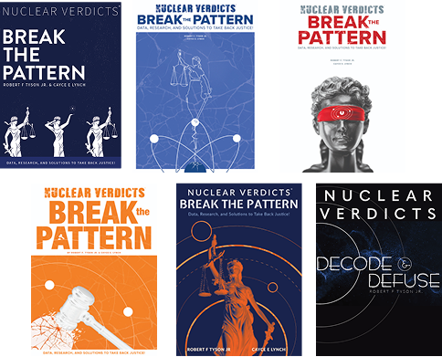
Ideation and Brainstorming
The primary goal was to design a compelling cover for the sequel to the legal industry’s bestseller, Nuclear Verdicts. It was essential to the design approach to create a high-contrast aesthetic that would maintain high visibility on digital platforms like Amazon without blending into a white background.
First Drafts
The early iterations focused on technical execution. Utilizing the client’s brand-compliant color selection and aiming for high contrast. I experimented with various fonts, testing how the atomic inspired patterns interact with the copy through varying compositions. Maintaining a balanced collaboration between the internal marketing team and shareholders.
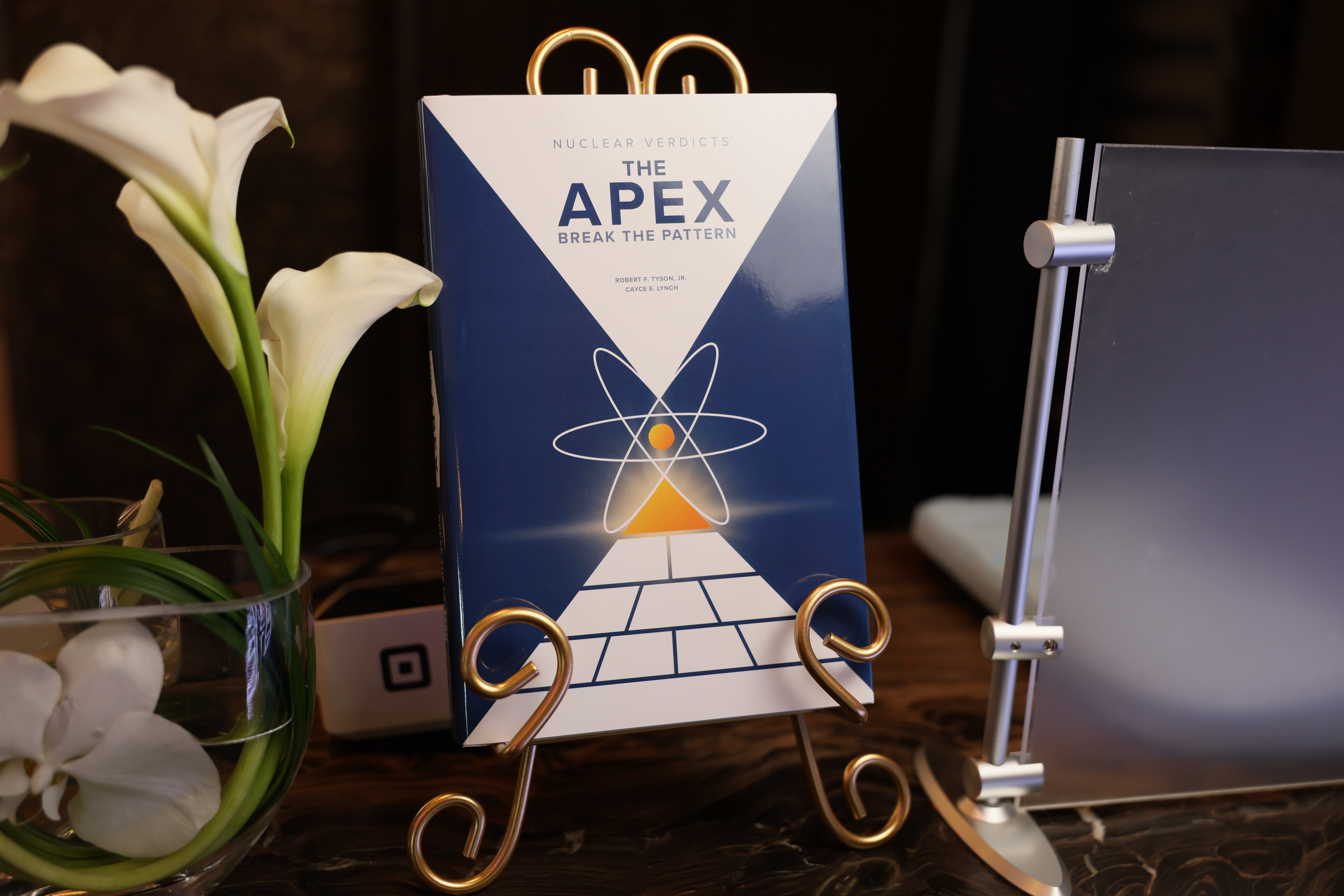
Final Draft
Needing to adapt to two sudden changes, I had to incorporate the authors’ "Apex Pyramid" method graphic and ensuring that the cover style was dynamic and adaptable enough that future books would clearly communicate being part of a series. Therefore, I simplified the framing into a bold and prominent structure capable of housing and future-proofing any elements in the next series. The final result hints at the Apex pyramid infographic with refined nuclear iconography. By this stage, heavy collaboration with printing partners assisted in the successful printing and release of soft cover, hard cover, and dust jacket iterations.