Tyson & Mendes

Redesigning the digital identity
of an innovative law firm.

View Site
Web Design
UX/UI
Visual Design
WordPress
in collaboration with the developer team, I contributed to a website renovation that transformed Tyson & Mendes’ digital presence. Guided by UX research and testing we achieved a modern and clean look.

The Challenge

Visually conveying “SoCal”, the site didn’t reflect the firm’s national presence. Our goal was to realign the brand's digital identity to communicate expertise as a leading legal resource. In brainstorming with multiple teams, we outlined a plan to modernize and enhance the site.
  • Navigation Overload - An excessive number of menu items with insufficient font contrast against a blue, cloudy background, hindering usability.
  • Misaligned Imagery - Coastal visuals, especially in the hero section, led to confusion about the firm's nationwide service areas and industry focus.
  • Inefficient Layout - A locations map below the fold consumed valuable space that could better promote key content or events.
  • Buried Contact Form - The contact form competed with a visually heavy section and required unnecessary steps to access.
  • Overlooked Insights - Important content such as insights and news was not prominently displayed, contradicting our goal of positioning the firm as a thought leader.

My Role

I was responsible for designing key pages, including:

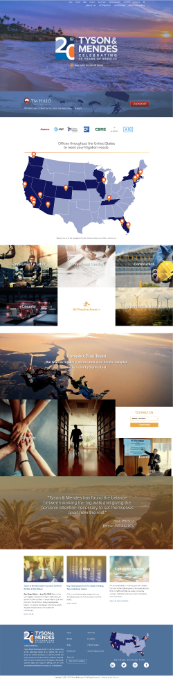
About Us: Highlighted the firm’s landmark Howell     case, a pivotal California legal precedent, to underscore credibility.
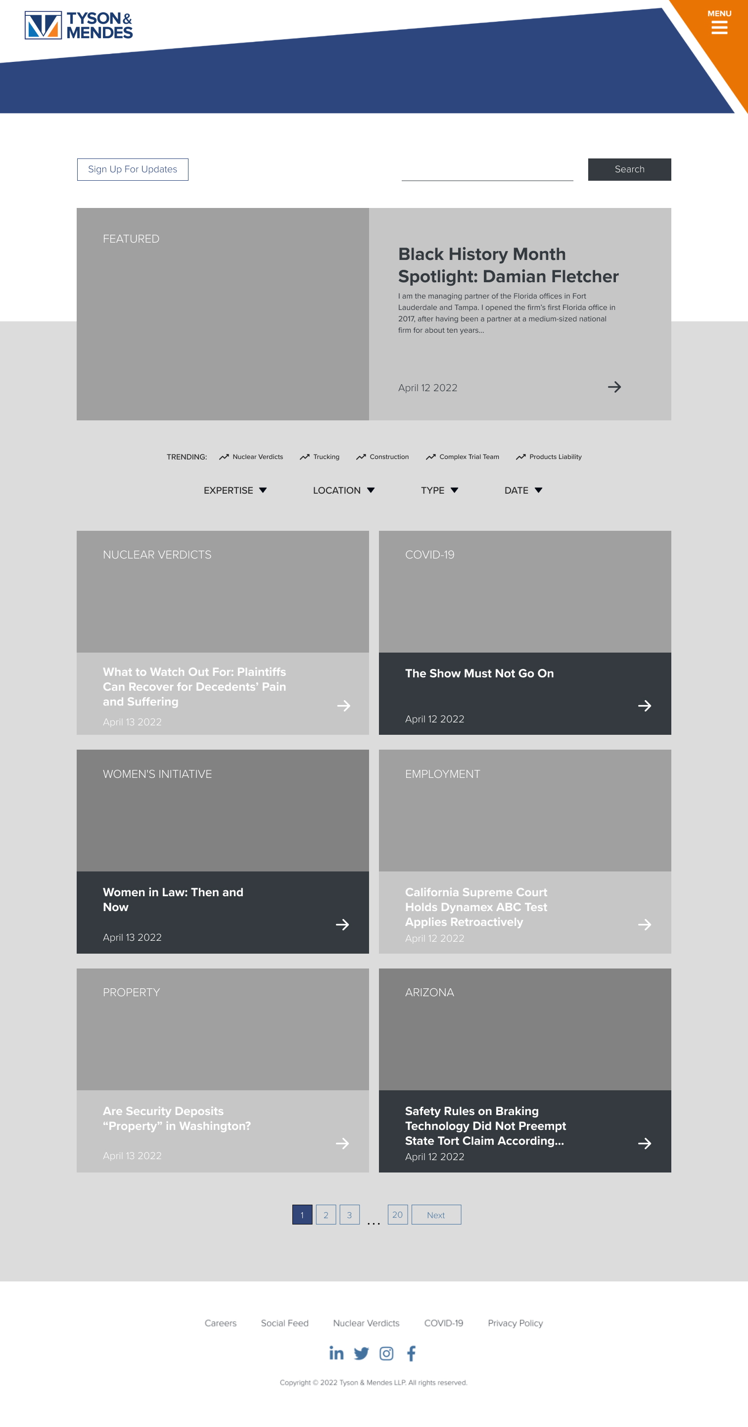
Locations & Diversity: Showcased Tyson & Mendes’     national reach and commitment to inclusion. Education & Blog: Designed features like trending filters in the blog to emphasize timely, insightful legal content.

Additionally, I collaborated on the home page redesign to align with the project’s overarching goals. Focusing on communicating expertise, improving user flows, and presenting the firm in a clear, engaging way.

UX Testing

We conducted remote user testing with five participants, focusing on:
  • Ease of navigation
  • First impressions of key pages
  • Task difficulty and user pathways
Key findings from user tests shaped iterative adjustments, enhancing usability and improving the user experience across the site.
View User Testing GuideExplore Detailed Usability Report

UX Testing

A total of five users were pooled to test the site remotely with their responses and tasks being recorded. Most of the test revolved around assessing the easiness of navigation, first impressions of various pages, and ranking difficulty on tasks while observing the paths that users would take to complete them.

Reaching High Fidelity

To create a cohesive visual identity, we refined the brand palette using the 70/30/10 rule. Ensuring consistency and directing user attention through clear hierarchy. The final design balanced visual clarity with content accessibility, allowing users to engage effortlessly with the site.

Final Site

Incorporating insights from UX testing and collaborative feedback, we delivered a polished, responsive website that reflects Tyson & Mendes’ national stature. The redesign improved usability, highlighted the firm’s expertise, and provided a user-friendly platform for both new and returning visitors.
View Site